Polett
Identity and mobile shop for a French fashion label, designed to turn hesitation into orders.
- role
Desk research
Proto-persona
E-commerce UX
UI design
Logo & identity
- tools
- FigmaIllustratorPhotoshopInDesign
( overview )
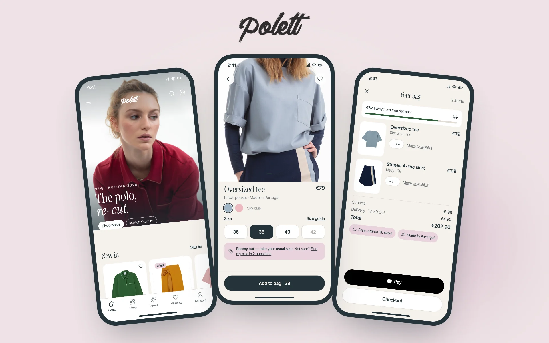
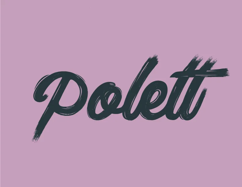
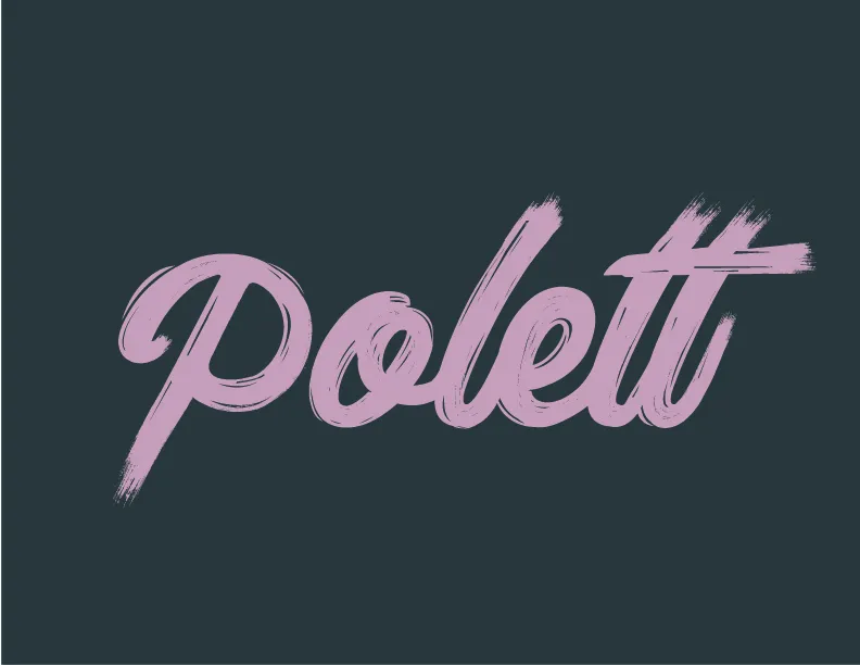
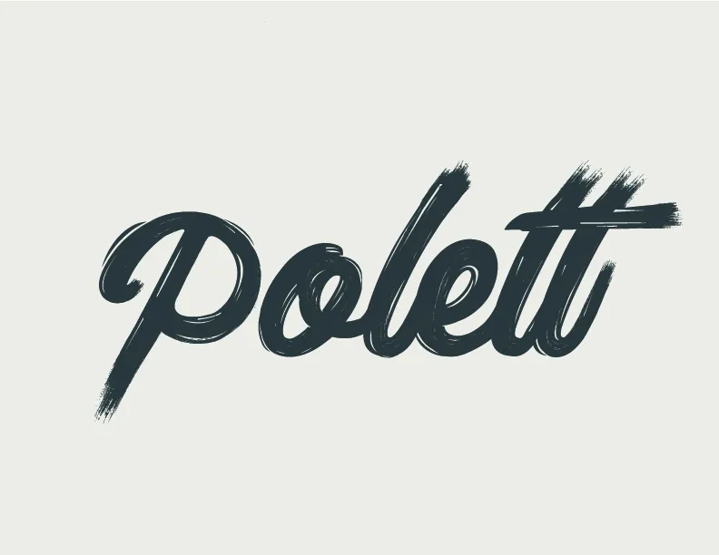
Polett is a French label of polos, tees and skirts. I designed its identity, with a brush-script logotype, a palette pulled from the fabrics, labels and hang tags, and its mobile shop, built for where its customers actually are: on their phone, coming from Instagram. The shop focuses on the one thing that stops people buying clothes online from a small label: not knowing if it will fit.
( the problem )
A small label competes with fashion giants on a phone screen. Customers can't touch the fabric or try the cut, they don't know the brand yet, and every extra step between a post and a paid order loses them.
( research )
What stops someone buying a €79 tee from a brand they just discovered?
Desk research on independent fashion labels, a review of how the brand was sold online, and the questions it received by message.
Fit uncertainty
Sizes vary from brand to brand, and an oversized cut makes it worse. Customers hesitate on size more than on price.
An unknown brand
Without the reassurance of a big name, returns, delivery and origin have to be visible well before checkout.
Mobile, from Instagram
Traffic arrives on a phone, from a post or a story, so every decision was made on a phone screen first.
Surprise costs
Delivery fees shown only at the last step feel like a trick, and people leave there.
( benchmark & persona )
Who we design for, and what we learned from others
Camille, 31, proto-persona
Discovers the brand on Instagram, shops on her phone in the evening, has returned clothes before because of size. Wants to be sure before paying.
Editorial labels
Independent French brands sell a story as much as a garment: the look, the fabric, the place it's made.
Fit information on the model
Showing the model's height and size is the simplest way to answer “how will it fall on me?”.
Express checkout
Wallet payments remove the address-and-card form, the step where mobile carts are abandoned most.
( fit )
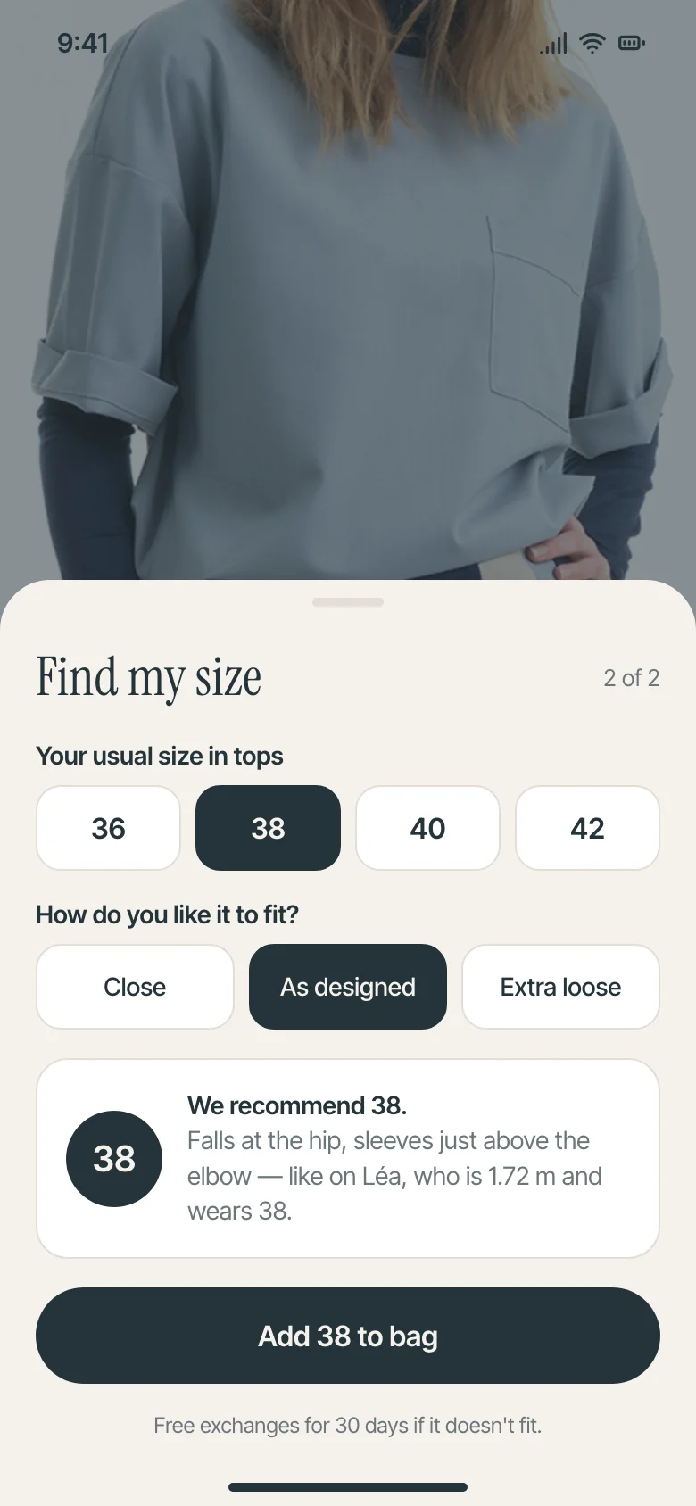
Find my size in two questions
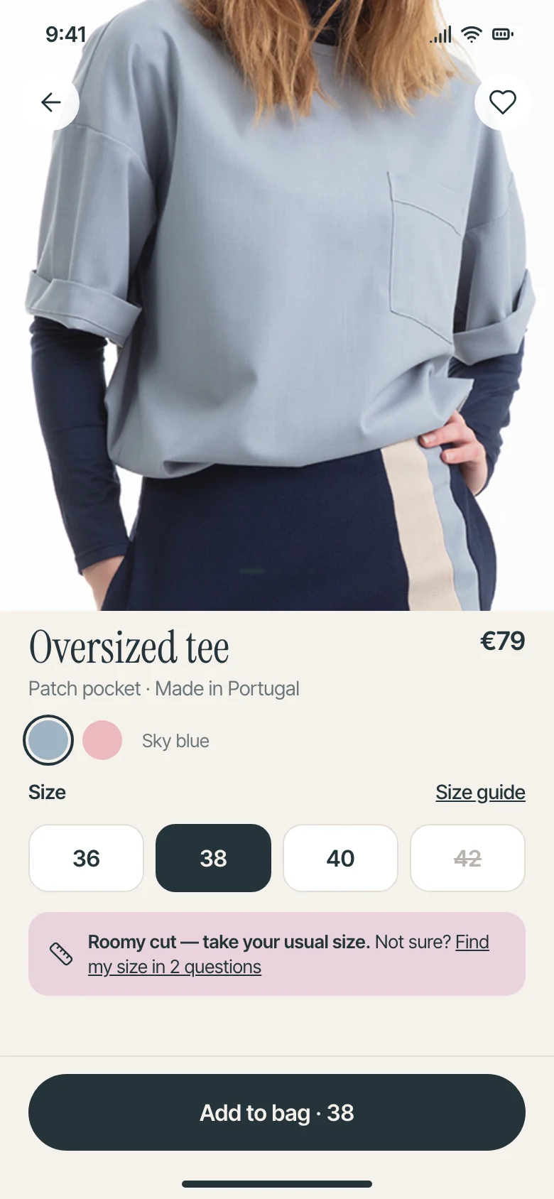
The product page says how the cut runs right under the sizes. If that's not enough, two questions about usual size and preferred fit return one recommendation, explained with the model's height and size.
- Sold-out sizes stay visible, crossed out
- The Add to bag button carries the chosen size
- Free 30-day exchange stated at the moment of doubt
( shop )
Editorial first, then two taps to pay
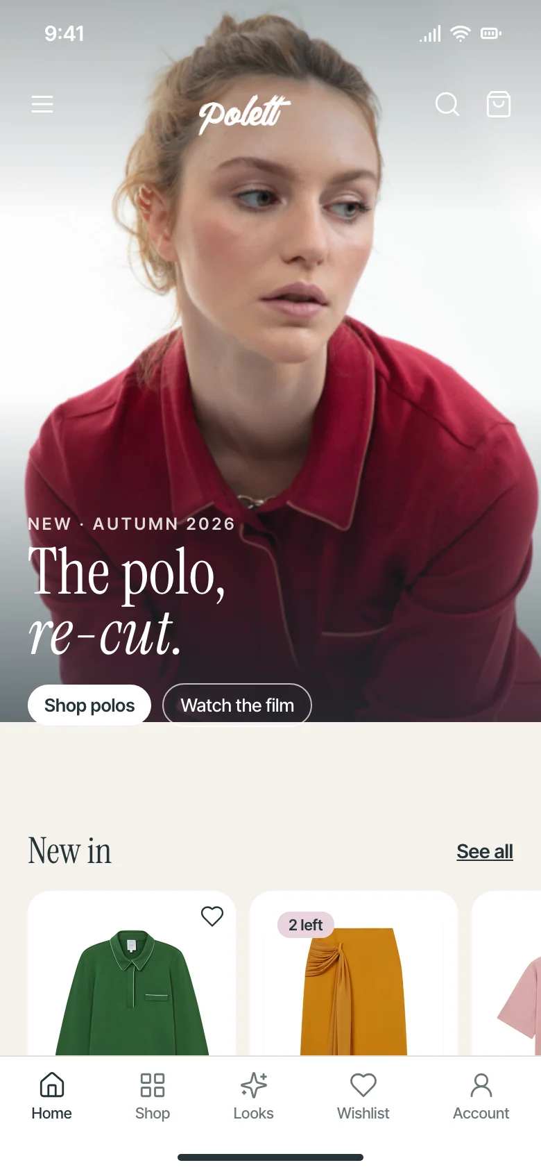
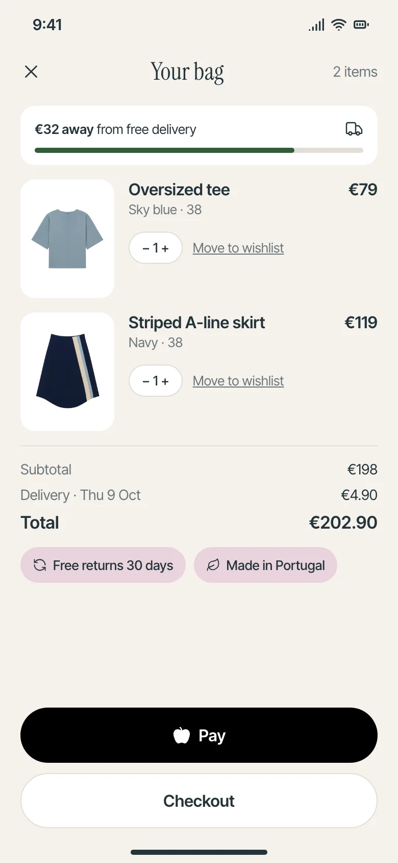
The home page opens on the collection's story, then new pieces with their stock. The bag shows how far you are from free delivery, the delivery date and the brand's promises, with wallet payment above the classic checkout.
( identity )
The brand it all sits on
( ux problems solved )
Turning each hesitation into a next step
“Will it fit me?” is the question that ends most visits.
→A two-question fit finder, and the model's height and size next to the recommendation.
Delivery costs discovered at the last step feel like a trick.
→A progress bar in the bag shows how far you are from free delivery, with the delivery date.
Typing an address and a card on a phone loses people.
→Wallet payment sits above the classic checkout.
Sold-out sizes vanished, so people thought the size didn't exist.
→Sold-out sizes stay visible, crossed out.
outcome
- Full identity: logotype, palette, hang tags, labels, icons
- A mobile shopping journey built around fit, trust and a shorter checkout
- A fit finder that answers the main hesitation before the bag, long before any return
( contact )
let's make it
clear.
Available for freelance projects and full-time roles
Freelance product design, UI/UX and brand projects, from a single flow to a full product, and full-time product design roles in UI/UX, design systems and AI-assisted product teams. Tel Aviv area or remote.