Muse Galerie
A mobile app for an art gallery and its online auctions, from research to a redesigned bidding journey.
- role
UX research
Personas & journey map
Wireframes
UI design
Heuristic audit & redesign
- tools
- FigmaPen & paper
( overview )
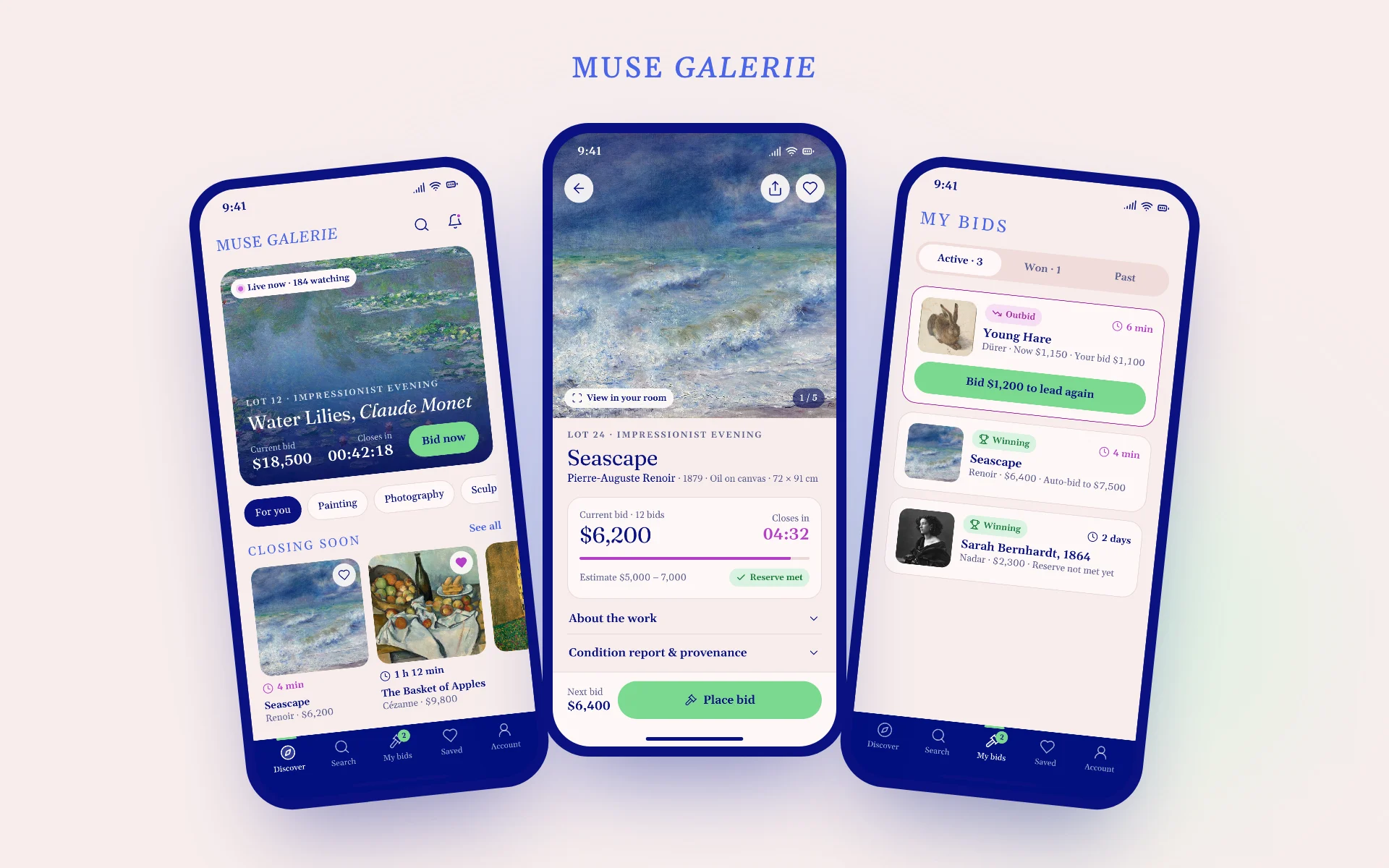
Muse Galerie lets people browse a gallery's collection and join its auctions from their phone. I ran the full UX process on it, from research, personas and key paths to wireframes and a first hi-fi. I then audited that first version and redesigned the bidding journey while keeping its identity: blush pink, navy, periwinkle and green.
( the problem )
Bidding from a phone still feels like a private club. Newcomers are put off by the jargon and by fees they only discover on the invoice, and regular bidders lose lots because they learn they've been outbid after the sale has closed.
( research )
Four pain points from the affinity map
“Am I winning?”
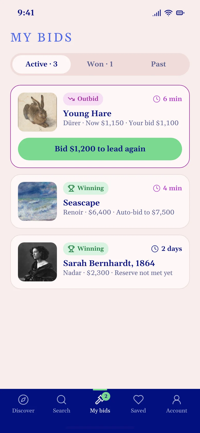
After bidding, people can't tell whether they lead or have been outbid.
“What will I pay?”
Buyer's premium and delivery only show up on the invoice.
“What does that mean?”
Reserve, hammer price, max bid: the vocabulary scares newcomers away.
“I missed the end.”
Sales close while people are busy, with no reminder to come back.
( discover )
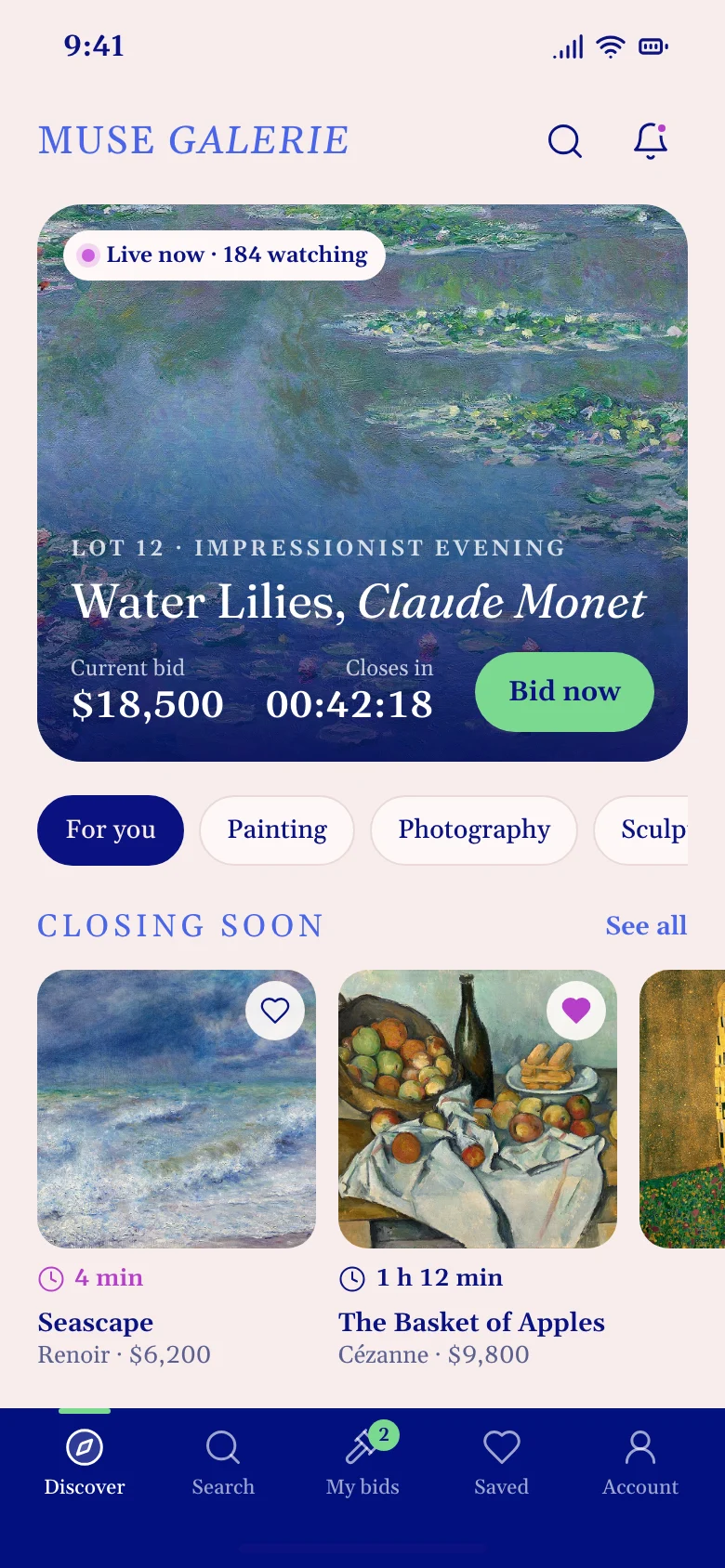
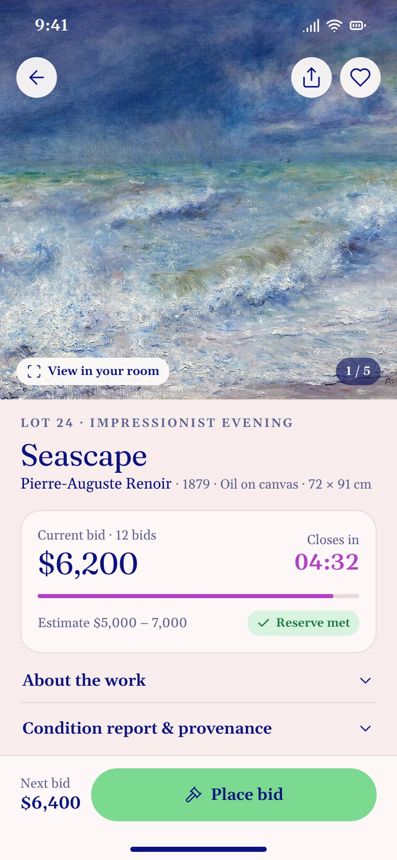
The live lot comes first
Discover opens on the lot that's closing: current bid, time left and one action. The whole card is tappable, so the green is kept for the one thing to do on each screen.
( bid )
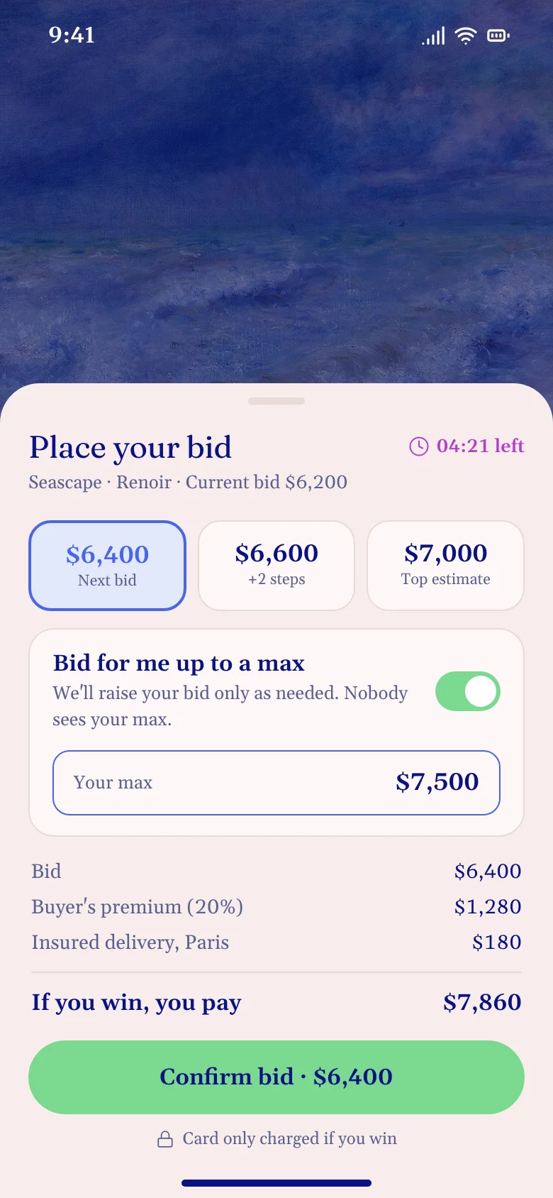
The price you'll actually pay
The bid sheet adds up hammer price, buyer's premium and delivery before you confirm. The max bid is explained in one sentence instead of being called “Bid max”.
- Suggested amounts, including the top estimate
- “If you win, you pay” total
- Card only charged if you win
( ux problems solved )
From confusion to confidence at the gavel
Bidders learnt they had been outbid after the sale closed.
→An outbid alert with a bid button on the lock screen, and My bids sorted by urgency.
Last-second bids made people feel cheated.
→Any bid in the final two minutes extends the clock by two minutes.
“Reserve”, “hammer price”, “bid max” scared newcomers away.
→Plain words such as “Reserve met” and “Bid for me up to a max”, each explained in one sentence.
outcome
- Full process: brief, research, personas, journey map, key paths, wireframes, style guide
- Heuristic audit of the first version, mapped to five concrete fixes
- The bidding journey redesigned end to end, in the original visual identity
( contact )
let's make it
clear.
Available for freelance projects and full-time roles
Freelance product design, UI/UX and brand projects, from a single flow to a full product, and full-time product design roles in UI/UX, design systems and AI-assisted product teams. Tel Aviv area or remote.