Omega Payments
A client area and mobile app for a digital payments platform, covering balance, exchange and transfers across fiat and digital currencies.
- role
UX audit
Information architecture
UI design
Design system
Mobile app
- tools
- Figma
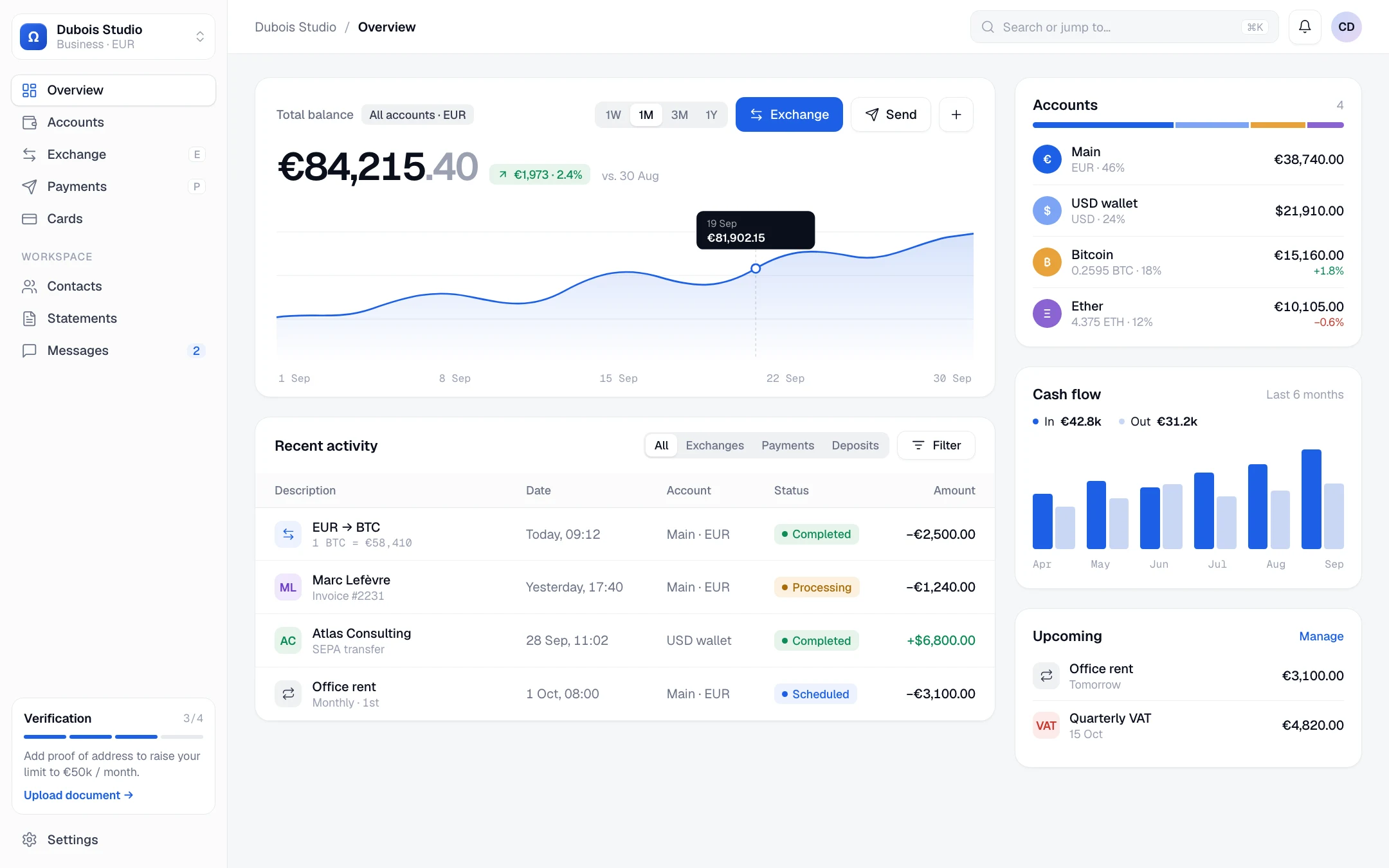
( overview )
Omega lets businesses hold, exchange and transfer money across fiat and digital currencies. I designed the client area and its mobile app around one question: what does someone need to see before they trust a money screen? The answer was a calm overview, costs shown before every action, and a mobile flow that makes a transfer feel safe.
( the problem )
Money screens are dense by nature, and every hesitation costs trust. Clients need to understand their balance across currencies at a glance, then exchange or send without ever wondering what it will cost or whether it went through.
( audit )
What needed fixing
The existing client area worked, but it made clients work too. An audit against today's standards surfaced four issues.
A donut you can't read
Holdings were shown as a pie chart with a legend below. Comparing slices by eye is slow, and exact amounts were hidden.
Costs discovered too late
The exchange rate and fee sat in small print under the form. The total only appeared on the receipt.
No status on money in motion
A transfer was either in the list or not. Clients couldn't tell processing from completed.
Desktop only
Twelve items in the side menu and no mobile view, for a product people check on their phone.
( overview )
“Where do I stand?”, answered first
The overview opens on the total balance and its trend over the month, with the two actions clients use most right next to it. Accounts, cash flow and upcoming payments sit in a narrow column on the right, so the page answers “where do I stand?” before “what happened?”.
- Change vs. last month shown as an amount as well as a percentage
- Every activity row has a status: completed, processing, scheduled
- Verification progress says what the next step unlocks
- Menu grouped and shortened from twelve items to eight, with keyboard shortcuts
( exchange )
Exchange without surprises
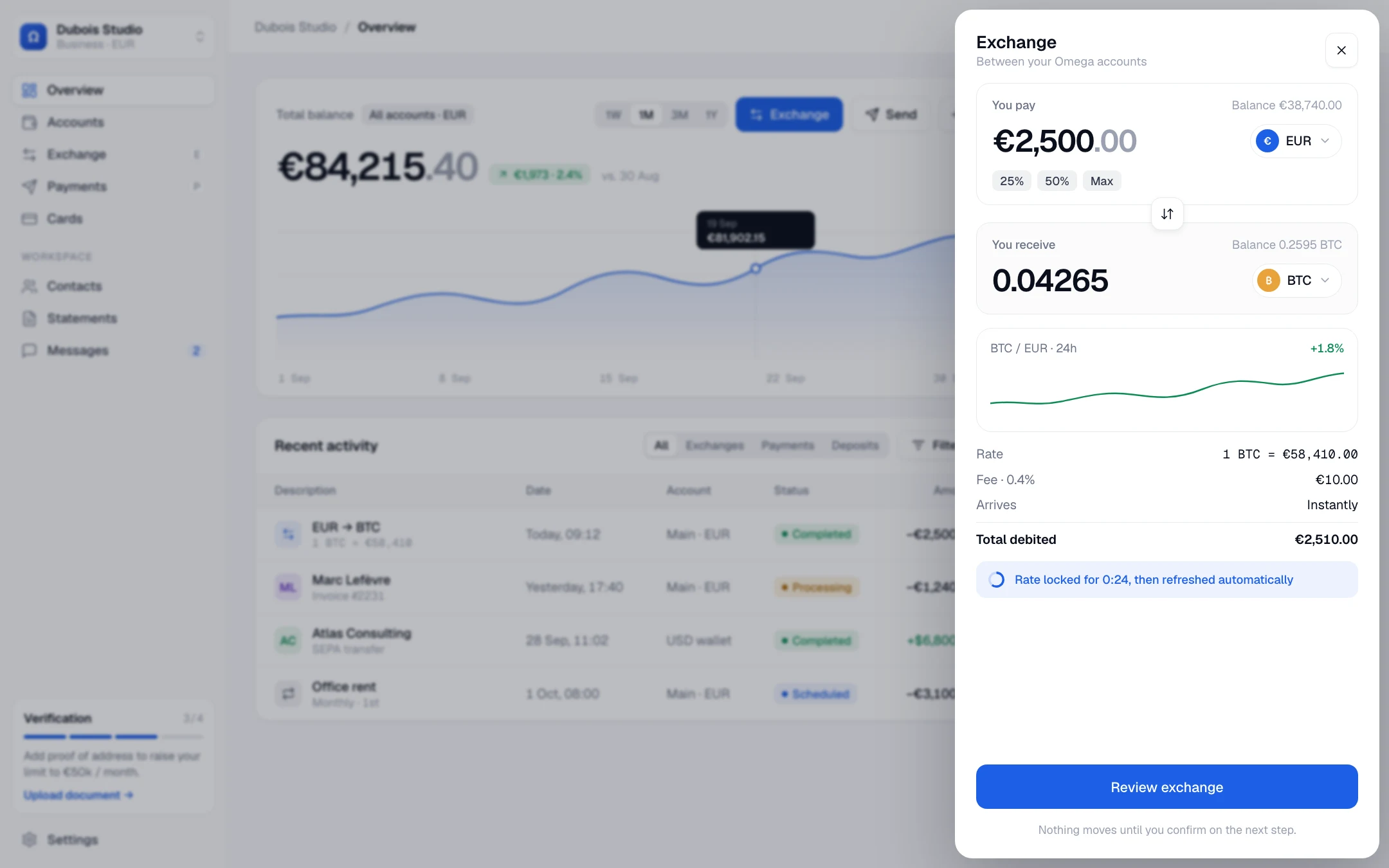
Exchange opens in a panel over the overview, so the balance stays in context. The rate, the fee, the arrival time and the total debited are all listed before the button, and a 24-hour chart shows whether now is a good moment.
- Rate locked for 30 seconds, with a visible countdown
- 25% / 50% / Max shortcuts
- A review step before anything moves
( mobile )
A transfer that feels safe
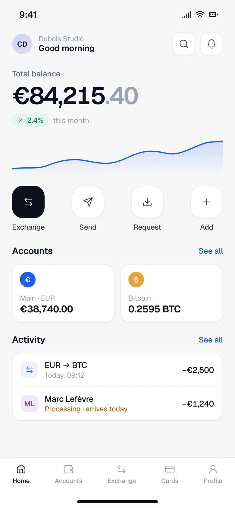
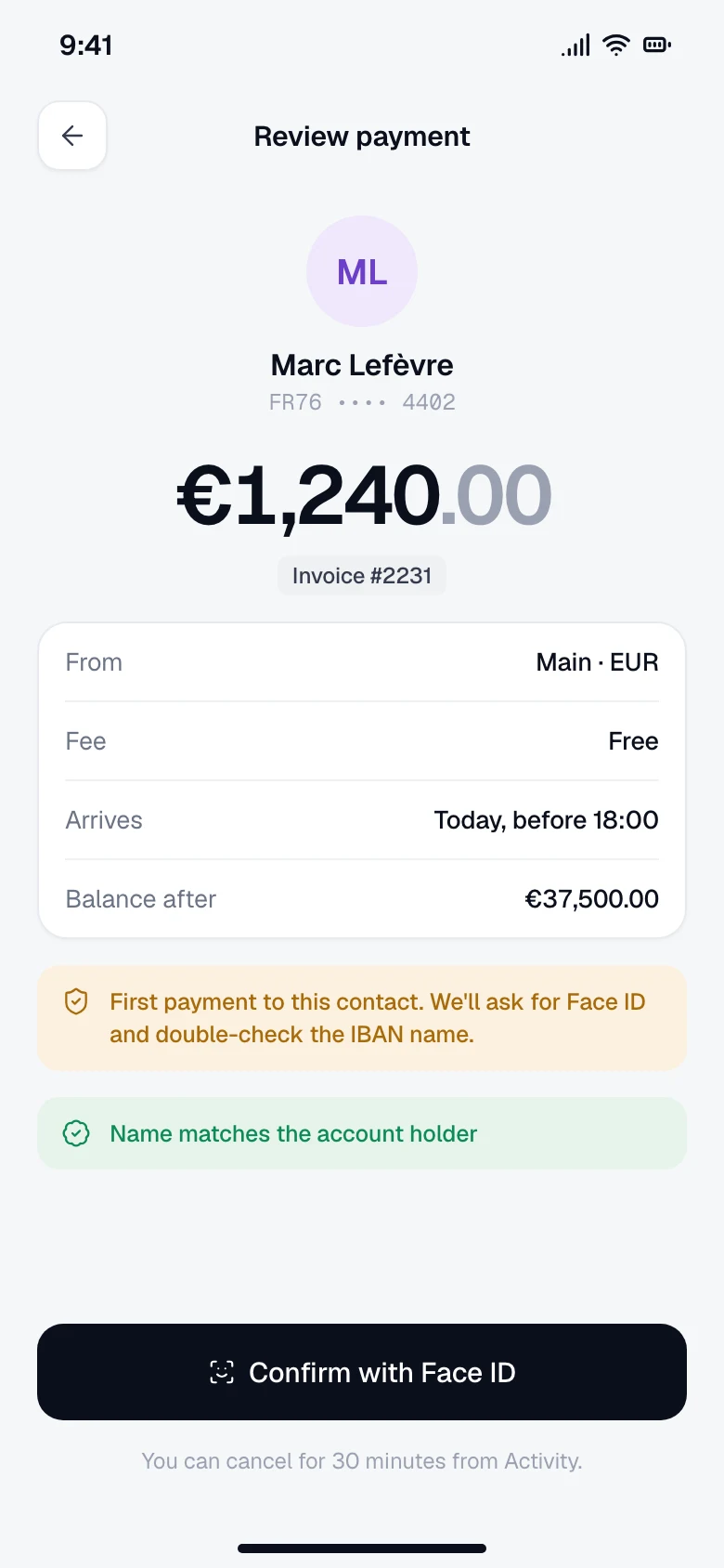
The mobile app leads with the balance, its trend and four quick actions, with accounts and recent activity underneath. The review screen answers the questions people actually have before sending money: who, how much, what it costs, when it arrives, and what's left after.
- Face ID and a name check for a first payment to a new contact
- Balance after the payment, shown before confirming
- 30-minute cancellation window
( ux problems solved )
Where clients hesitated, and what changed
Clients were afraid of exchanging at a bad moment, or at a rate that moved while they typed.
→The rate is locked for 30 seconds with a visible countdown, next to a 24-hour chart.
A transfer disappeared into the list: nobody knew if it had gone through.
→Every movement carries a status (completed, processing or scheduled) and an arrival time.
Sending money to the wrong person is the fear behind every first payment.
→A name check against the IBAN, Face ID for new contacts, and 30 minutes to cancel.
Fees appeared on the receipt, after the money had left.
→Fee and total debited are listed before the button, and nothing moves before a review step.
outcome
- Overview, exchange and mobile payment flows built around cost transparency and status
- One design system shared by desktop and mobile
- A shorter, grouped navigation, from twelve items down to eight
( contact )
let's make it
clear.
Available for freelance projects and full-time roles
Freelance product design, UI/UX and brand projects, from a single flow to a full product, and full-time product design roles in UI/UX, design systems and AI-assisted product teams. Tel Aviv area or remote.